Quantcast
Channel: James Russell
Viewing all 249 articles
Browse latest View live

Angie Lewin: New Watercolours in Edinburgh

$
0
0
Angie Lewin, Spey Still Life & Yellow Book (artist copyright)
Just received some lovely pictures of new Angie Lewin watercolours, ahead of her exhibition in Edinburgh. Is it my imagination, or is there a hint of Charles Rennie Mackintosh in some of these flower paintings? The layering of translucent colours seems to be new, or maybe I'm just looking properly! As ever, the paintings are carefully composed, at once structured and loose, realistic in some ways and stylised in others. Lots of energy too - I love the way the pattern springs away from the Persephone bowl.

Angie Lewin, Calendula Study (artist copyright)

Angie Lewin, Dice Cup and Feather (artist copyright)

Angie Lewin, Cone Flower  (artist copyright)

Angie Lewin, Persephone Bowl (artist copyright)

Angie Lewin, Wild Garden Seedheads (artist copyright)

Angie Lewin, Auden Thalictrum (artist copyright)
These and other watercolours will be shown in Angie's exhibition 'A Natural Selection' at The Scottish Gallery, Edinburgh, during May. Gallery Director Christina Jansen comments:

"We are delighted to present Angie Lewin’s first solo exhibition with The Scottish Gallery. She is best known as a designer and printmaker whose sensitive patterns and motifs are inspired by the English Arts and Crafts movement and the work of Bawden and Ravilious. She divides her life between homes in Edinburgh and Speyside and this geographic diversity is reflected in her plant observations and interweaving of the natural and domestic worlds.

"She walks, looks and draws; she collects and assembles and her studio is full of reference material, beautiful in itself witnessing a life lived in art and nature. Her chosen medium for this exhibition is watercolour, that most sensitive and difficult medium and her virtuosity is complete but should be no surprise in the context of her rigorous apprenticeship. The playful title for this show hints at her obsessive observing, refined through the artist’s editorial eye to make order out of chaos."

FFI: The Scottish Gallery


Eric Ravilious: 'Greenhouse: Cyclamen and Tomatoes'

$
0
0
Eric Ravilious, Greenhouse: Cyclamen and Tomatoes, 1935 (Tate)
As yellow tomatoes ripen on the vine above, twin lines of cyclamen in orange pots draw us through one open doorway then another, until we are faced by the final, closed door, so pale and faint it seems to float just above the centre of the picture. In startling contrast to the wide open spaces of his other paintings of 1935 – ‘The Waterwheel’ or ‘Downs in Winter’ – this greenhouse pulls us into an intense interior world. Not that this is an oppressive space. Light and spacious, apparently roofed with nothing more substantial than tomato plants, the greenhouse offers a pleasant dream of infinite regression.

Ravilious stumbled upon this horticultural treasure while exploring the village of Firle, one of eight greenhouses concealed within a walled garden built to supply Firle Place with fresh produce. Along the walls grew espaliered fruit trees, including the celebrated greengages first introduced to Britain in the eighteenth century by Sir William Gage, while the hothouses included a mushroom house and a rare Victorian strawberry house in which plants grew in the warm air close to the roof and were lowered by pulley for picking.

This fabulous kitchen garden was watched over by the bearded head gardener, Mr Humphreys, who had, as a young man, travelled up the Amazon on a journey of botanical discovery. Ravilious befriended him and went on to paint several of the greenhouses, creating a monument to these elegant structures.

You can buy tomatoes from the same greenhouse today, from a stall across from the Firle Stores, though the rest have all but disappeared. In 1944 a Spitfire brought down a doodlebug nearby and the resulting explosion shattered every pane of glass in the village; the walled garden never fully recovered. The great storm of October 1987 caused further destruction, plucking whole polytunnels from the ground and spiriting them away.

But this one greenhouse survives, lovingly maintained and tended by Firle native Jim Piper. He remembers what the garden was like when he was a boy, when his mother was nurse to the Gage family, but though in his seventies he is too young to remember Mr Humphreys. He does, however, tell a story of the venerable botanist’s old age. Old-fashioned in dress and outlook Mr Humphreys was the object of good-natured taunts from village lads, delivered from the safety of the churchyard beyond the garden wall.

‘None of you buggers knows anything about hard work,’ he liked to retort, ‘But when I snuff it you’ll have to work bloody hard because I’m going under that yew tree.’

Sure enough his grave can be found only yards from the garden, in the tough tangle of roots beneath the churchyard yew.


This is an excerpt from 'Ravilious in Pictures: Sussex and the Downs', published by The Mainstone Press. The painting is currently on show at Dulwich Picture Gallery. Meanwhile, Laura Freeman has dug up further info on the Firle greenhouses, which you can read about here.

Hastings

$
0
0

I travel quite a lot doing research and giving lectures, but it isn't very often I come across a town like Hastings. Admittedly I was only there one night, but the place made an impression. I was there to give a talk on Eric Ravilious at the Beacon Arts Centre, an eccentric and altogether delightful institution that I would recommend as a place to stay; unusually for an arts venue, it also does B and B.

A former boarding school, the Beacon is, as its name suggests, perched on a hillside overlooking the town, with a garden surrounded by trees that made me feel as though I'd wandered into a Paul Nash painting. The audience for my talk was so lively I wondered at first whether I'd be able to get a word in; I also recorded my youngest lecturee, an exuberant 9-month old baby.


The next morning I set off down the hill into Old Hastings, negotiating a maze of alleys and stairways between houses and gardens. With its junk shops, cafes and characterful old buildings the place is a bit like Rye, but more real and less postcardy. In a particularly notable shop called Robert's Rummage I found a copy of 'Pompeii and Herculaneum: The Glory and the Grief' with photos by Edwin Smith; the proprietor described how, on a recent visit to Pompeii, he had stood for hours in a queue for the brothel.

'Crazy,' he said, 'The place had been shut for 2,000 years!'


On down the hill to the seafront, which has been known since pre-Norman days as the Stade. I'd planned to have a look at the Jerwood Gallery before catching the train home, but ended up wandering round for hours. There can't be many other stretches of the south coast where so much is going on, from an impressive array of seaside entertainments - gokarts, crazy golf, etc - to the bustle of an extremely active local fishing industry.


I remembered reading a few years ago that the siting of Jerwood on the Stade had been unpopular with the local fishing community, but I had no idea quite how close the new building is to the fishermen (about twenty yards) and quite how striking the contrast is between the workaday sprawl of huts, boats and gear, and the elegant gallery.


The Jerwood really is a fine building, rather unassuming from the outside and nicely proportioned within to fit a collection of Modern British Art that is generally on a modest scale. There was a small but invigorating exhibition of Edward Burra watercolours upstairs - including two beautiful 1920s landscapes - and a rather grander show of Scottish paintings that featured some lovely work by Anne Redpath, John Bellany and Craigie Aitchison, among others.

Edward Burra, The Harbour, Hastings, 1947 (copyright Burra est/Lefevre Fine Art)


One or two fishing boats had made it into the Burra show, but there were many more out on the shingle, showing great variety in age and design but sharing a robust fitness-for-purpose. With a brisk sou'westerly blowing and the sea crashing on the stones below this was the sort of scene that inspired a number of the artists on show at Jerwood. Let's hope both the gallery and the fishermen enjoy a prosperous future.


PS If you enjoyed this post, then you may well enjoy the one over here.


Ravilious, Auerbach, Englishness

$
0
0
Eric Ravilious, Waterwheel, 1938, painted at Capel-y-Ffin, Wales; described by ER as 'a bit Chinese'
I had a phone call last week from columnist Ian Jack, who wanted my opinion on the subject of Eric Ravilious and Englishness; his typically nuanced and thought-provoking article is here. The fact that Ian is Scottish made our conversation particularly interesting, from my side at least. My father was from north of the border, and bar the accidents of fate I might have grown up in Edinburgh. If I now think of myself as English it is perhaps because 'British' carries echoes of the imperial past, although it may have more to do with cricket.

Currier and Ives, Champions of the Mississippi, 1866 lithograph: a similar print hung above ER's mantlepiece
The Ravilious name is not especially English-sounding (it's probably Huguenot), and during the war he sometimes found himself rather desperately identifying himself to bayonet-wielding sentries. As Baptists Eric's parents were part of the Non-Conformist movement that opposed the authority of the Church of England; he abandoned Chapel but retained a fundamental belief in personal freedom. This is reflected in his refusal to join the various movements on offer (Surrealists, Unit One, etc), in a lack of enthusiasm for party politics, in his (and his wife's) complicated romantic lives, and above all in his determination to follow his own vision. Conflict with wartime superiors was one result of this attitude.

Was that vision particularly English? There are paintings on view at Dulwich Picture Gallery which were created in Scotland, Wales, France and Norway, as well as England, but Ravilious was perhaps most inspired by the South Downs. The simplicity of the landscape, the chalky soil and the pale light appealed to him; horses and giants carved into the chalk resembled wood engravings, and so were perhaps more attractive still.

Georges Seurat, The Channel of Gravelines, 1890 oil, Indianapolis Museum of Art
It doesn't follow, however, that his choice of particular subjects reflected a nationalist or even patriotic impulse. True, Ravilious and his friend Edward Bawden were influenced by English artists of the past (Palmer, Cotman, Towne) but their interest in the local and particular was fuelled by exposure to the work of Van Gogh, Seurat and sundry other European painters (some of whom had been inspired, circuitously, by Constable). Did Van Gogh paint in Arles because he was on a retainer from the local tourist board? Was Monet out to boost Rouen Cathedral?

Ravilious had plans at different times to visit the United States, Greenland and Russia, among other places. Had he survived the war perhaps he would have beaten David Hockney to California. His favourite book, after all, was 'Huckleberry Finn'.

Hokusai, Ocean Waves, c1830
Having said all this, is there something peculiarly English about the way Ravilious approached his subjects - in his style? Again, there are no simple answers. He began his career as a draughtsman who tinted his drawings, and as such was following a very long insular tradition of line drawing, one that Paul Nash related back to Celtic design and medieval book illustration. (Nash, incidentally, talked in terms of British art, not English.) There's a brightness and clarity about his watercolours that, again, seems to have insular roots, although these are equally features of 19th century Japanese prints - which also display a marvellous use of line. You could probably argue that much of the Englishness we see in Ravilious comes instead, indirectly, from Asia.

Eric Ravilious, Storm, 1941, British Council

It's a tangled business, this, and to illuminate I'd like to introduce Frank Auerbach, the German-born British painter who has a retrospective at Tate Britain this year. Reading an interview in The Guardian yesterday I was struck by his humour, modesty and good sense. In particular he had this to say about art history:

“Aesthetics is more interesting than history. I wonder sometimes if people who are taught art history were asked to describe pictures, rather than put them in various sociological or historical settings of influence, how much they could say that would make somebody else see more in them. Does the quality of appreciation somehow atrophy when they assume that everything is part of a general story, rather than the general story being a vast mass of the mediocre and a few really great pictures which make the whole activity worthwhile, and which have a curious fellowship throughout the ages? Finally what matters is whether the picture works, and that could be Giotto or Fragonard or Monet, and finally the criteria as to why it works are the same. In a way I think of a Cézanne and a Giotto being closer to each other than a Cézanne and a Pissarro.”

So we can discuss Ravilious in all sorts of ways, and reach all manner of conclusions. But in the end it's the pictures that matter.

Frank Auerbach: Speaking and Paintingby Catherine Lampert is published by Thames & Hudson on 25 May, priced £19.95. The exhibition will be at Tate Britain, London, SW1P from 9 October. tate.org.uk.

Ravilious continues at Dulwich Picture Gallery until August 31. I'm doing a series of three talks at Dulwich, starting this week (info in sidebar, over that way -->)

Wanted: Artist's Face for £20 Note

$
0
0
Laura Knight with model, self-portrait, 1913, copyright artist's estate
So the Bank of England is looking for a new face for its £20 note, the face of a visual artist. We the public are being asked to make suggestions, a handful of which will eventually be presented to a committee including a trio of experts - among them Andrew Graham-Dixon - for a final decision. Given that the artist concerned has to be dead to qualify, we can't nominate Tracy Emin, Banksy or Grayson Perry. So who does that leave? Which no-longer-living artists still matter to people at large? Turner? Constable? Ravilious???

Barbara Hepworth, photo copyright Peter Keen, 1950s, NPG
These are all men, obviously, and here we have the first potential source of conflict. Today we are used to men and women sharing the white cube of the contemporary art space, but this relative equality is a recent phenomenon. Before Laura Knight's generation successful women artists were few and far between, and even during the 20th century there were not many household names. Come to think of it, Dame Laura would be a good choice, not a modern like Barbara Hepworth but a painter whose work has given pleasure to many.

I can't see AGD plumping for anyone from the last century. His History of British Art got through the interwar years in just a couple of pages. But Modern British is in the ascendant, and the auction houses would love to see Hepworth's face printed on the piles of money the publicity would generate. She has a good face for a banknote, a serious face with plenty of character. Then again, choosing Lucien Freud might give the Queen an opportunity for revenge; large HM on one side, tiny Lucien on the other...

JMW Turner, self-portrait, Tate
Is it unusual for a banknote to have potential as a marketing tool? I don't think the current incumbent of the £20 note, Adam Smith, makes anyone much money, does he? But an artist's image would surely do wonders for sales, especially if it's someone whose reputation could use a bit of a boost. Sir So'n'so Somebody, as featured on the new £20 note. Will there be lobbying by Interested Parties? What about artist in the Bank's own collection? It could all get rather murky.

Tim Spall as Turner, in Mr Turner, 2014
No doubt the bookies' money will be on one of the big names from the glory days of yore. Turner must be the front-runner, although people might not recognise him unless Timothy Spall reprises his movie role for the occasion. But there is a self-portrait in the Tate which would be perfect; the note could be launched at TB, alongside the mother of all Turner exhibitions. As well as the actual notes (Gift aided for the occasion?) we could buy postcards of the notes, not to mention teatowels, pencil cases and what have you.

Thomas Gainsborough, self-portrait, NPG
Gainsborough would make a rather more elegant subject. Although he hasn't been portrayed on the big screen lately, he would be no more obscure than Sir John Houblon, the 17th century banker who presently adorns £50 notes. His self-portraits are suitably dignified, whereas Turner may be a bit wild for a banknote. Stubbs is another option, perhaps represented by one of his horses. Hogarth is a contender too. And William Morris, though I'm not sure how he felt about the banking system. And Rossetti...

But the winner will no doubt be Turner, which is a shame. It would be fun to have the kids asking, 'Dad, lend us a Grayson.'


Eric Ravilious: The Westbury Horse - on film!

$
0
0


Here's a short video of me discussing Ravilious on the day the Dulwich exhibition opened. If you feel I'm not talking complete rubbish please do come along to one of the talks I'm giving over the next month - details in the sidebar...

Ravilious on Film part 2: Inspired by Place

Summer at the RWA, feat. James Ravilious

$
0
0
James Ravilious, Archie Parkhouse & his dog Sally, copyright Beaford Arts
Exhibition launches at the Royal West of England Academy in Bristol are always fun, partly because the building is so impressive and the staff so cheerful, but mostly because the work on display is so varied. This time around there are three exhibitions, linked by a broad theme but otherwise remarkably diverse.

This being Bristol's year of being European Green Capital the three exhibitions are united by the artists' shared interest in nature and our relationship with the natural world.

In the main room, with its wonderful high ceiling and natural light, are gigantic works on paper by Peter Randall-Page RWA and (as of last week) RA, across which flow great tributaries, or family trees, or neural pathways in brown or black ink. Pattern and order on the one hand, freedom on the other, combining to give an impression of organic systems.

One work forms a screen, behind which lurk other, rather different forms. Actually some of these are beautiful, while others recall Surrealist fantasies of creatures alarmingly combined. It would really spoil the surprise if I described them. Suffice to say, Kate MccGwire must spend an awful lot of time collecting feathers, while the installation of her gorgeous-but-monstrous creations is surely a logistical nightmare.

James Ravilious, John Bennett, traveller, copyright Beaford Arts
In a way the world of James Ravilious is equally strange. No fantasy here, mind you. His photographs, taken in the last quarter of the last century, represent real places and real people, all (as far as I remember) in rural North Devon. The strangeness is found partly in the subject matter, a hands-on country life far removed from modern urban existence, and partly in the photography itself.

Although he chose photography over drawing or painting, James shared important qualities with his father Eric (who died, it should be noted, when he was only three), such as clarity of focus, a powerful sense of structure and a willingness to work with the sun in his eyes. Here and there one can see the influence of Edwin Smith, whom James got to know through Peggy Angus, but most of the work is unmistakeably, charismatically his.

One of Eric's less well known skills lay in making friends with people - the owners of greenhouses or abandoned lighthouses, patrons, etc - and in his decades taking photographs for the Beaford Archive James demonstrated an even greater sociability. Rather than snap people anonymously he got to know them, often very well, so that they trusted him and were themselves in front of his camera. Go and have a look, and if you know anyone who is studying photography tell them they HAVE to go.

Laura Knight, Spring, 1916-20, Tate
Finally, through the heavy door and into the climate-controlled rooms, where paintings from (or loosely associated with) the Newlyn School are on display. Instead of fishing boats and bays here are fields, farms and working people, the same kind of people portrayed by James Ravilious but romanticised somewhat. The colours throughout are fresh, the mood generally light, with the freshest, lightest painting of all being Laura Knight's effervescent 'Spring'.


Ravilious on Film: Dangerous Work at Low Tide

$
0
0


Here's the third part of the film shot at Dulwich Picture Gallery by the splendid Acap Media. Great close-ups of several lovely paintings from the last room of the Ravilious exhibition: Darkness and Light.

Postcard from the Isle of Wight

$
0
0

Finally had a full week away and am now able to string a sentence together again. Must have been quite tired after putting on Ravilious show, but a week on Wight has set me straight. I can't believe it's taken me this long to cross the Solent, especially as we went to Poole every summer for years when I was a kid, but I think I know why I failed to discover the island before now: it's because of the Beatles.

Every summer we can rent a cottage in the Isle of Wight
If it's not too dear
We shall scrimp and save
Grandchildren on your knee
Vera, Chuck & Dave


In my mind these lyrics got scrambled perhaps, so that I imagined an island entirely populated by people with cheery old-fashioned names, all scrimping away. Not a very glamourous picture.

At first sight the island didn't seem any different to 'the mainland' (ie the rest of Britain). Red brick houses, mini-roundabouts, Waitrose, lots of trees. Driving on the left seemed disappointing, as did the excessively regimented, hedge-bound campsite we had booked. Rather more startling was the nearby town of Shanklin, which ought to be made a World Heritage Site for its concentration of thatched tea shops.

The fabulous Compton Bay

It took a day or two, but we gradually discovered another Wight, away from the yachts and caravans, the tea shops and bizarrely named amusement parks - fancy a day at Blackgang Chine anyone? Ventnor, a town that sounds as though it belongs in a Terry Pratchett story, offered impressive Victorian buildings and family-owned shops - a feature of the island generally. Saturday afternoon everything seemed to be shut by 4 (except for the inevitable Tesco Express). We had fish and chips on the Esplanade, looking out over the sea with a simultaneous sunset/moonrise for atmosphere and about a million less people than you would find in, say, Lyme Regis.

Barbara Jones was a fan of the island

My favourite region of this surprisingly magical island was the south west coast. We did try to see the Needles but were stymied by thick fog. Instead we went bodyboarding in the rain in Compton Bay, which ought to be in a Top Fifty British Beaches, and probably is. There's a campsite above it which seemed impressively bleak in the generally grim weather; behind a farm which should be used as the set next time someone films 'Cold Comfort Farm'. Geese guarded the approach, while a turkey glared out from an open shed. Fabulous.


Having taken the tent down in an outrageous downpour we sought shelter in the lovely Piano Cafe in Freshwater Bay, surely a building dating from the island's late Victorian heyday, then walked up onto the downs to visit the Tennyson Memorial, put up to commemorate his years living in Freshwater.

I studied the gloomy laureate for A Level but could only remember:

She only said, 'My life is dreary,
He cometh not,' she said,
She said, 'I am aweary, aweary,
I would that I were dead!'

This was deemed too miserable for a (now) sunny day. To which I ought to have responded with this...

Break, break, break, 
On thy cold gray stones, O Sea! 
And I would that my tongue could utter 
The thoughts that arise in me.
 

O, well for the fisherman's boy, 
That he shouts with his sister at play! 
O, well for the sailor lad, 
 That he sings in his boat on the bay! 

And the stately ships go on 

 To their haven under the hill; 
But O for the touch of a vanish'd hand, 
And the sound of a voice that is still!
 

Break, break, break 
At the foot of thy crags, O Sea! 
But the tender grace of a day that is dead 
Will never come back to me.
 
Back in Bristol the drizzle is a-drizzling and it doesn't look like we will ever be able to get through the inevitable mountain of post-camping laundry. Meanwhile, the Ravilious show is about to end, and we're putting the finishing touches to 'The Lost Watercolours of Edward Bawden'. More about that soon.


Reflections on Ravilious at Dulwich

$
0
0
Ship's Screw on a Railway Truck, 1940 (Ashmolean)
Now that the Ravilious show is nearly over, I wanted to say thankyou to everyone who made the minor trek to Dulwich this summer. Do go and see their MC Escher exhibition, which is coming up next - it should make a fascinating follow-up to Ravilious.

I still can't quite believe people have been queuing up for Rav, but perhaps I'm looking at this the wrong way round. Perhaps we should be marveling that it has taken so long for such a wonderful artist to achieve deserved public recognition - not that it's particularly unusual for an artist to achieve renown long after their death. To take one example, Vermeer was just one 17th century Dutch artist among many until his cause was taken up two hundred years later.

I was surprised by the enthusiastic response shown by critics to the exhibition, which I think bodes well for the continuing reassessment of 20th century British art, particularly figurative painting of the 1920s and 1930s. I'm looking forward to the David Jones exhibition coming up at Pallant House in October, which promises to be filled with rarely-seen wonders.

The beautiful new book on his work as a watercolourist and printmaker, by Ariane Bankes and Paul Hills, makes for interesting comparison with the Ravilious catalogue, especially as Rav was a big fan of Jones and visited his London shows in the late 1920s.

It seems a long time since I walked into the exhibition rooms at Dulwich to see the paintings all lined up against the walls, still in their crates and boxes. For the previous eighteen months I had been moving thumbnail images of the pictures around a scale plan of the gallery, which was stuck with blutac all over the landing walls. Every now and again a picture would fall off, to be transported on the sole of someone's foot around the house, so that tiny planes and greenhouses would turn up in the most unlikely places. To see the pictures as large as life and all together was very moving.

I imagined that the hang would bring some kind of closure, but the opposite was true. Being able to look at so many watercolours up close I saw so much that I had missed; I wanted to rewrite the catalogue there and then, but I don't think the publishers would have let me. Then there were all the observations made by critics and visitors, which in many cases made me look at a picture afresh. More than ever I appreciate that anyone with an intelligent gaze can add to our understanding of an artist or their work.

Finally, it has been extraordinary to meet so many people through the exhibition: lenders, fellow writers, artists, enthusiasts. On one memorable occasion I stood in front of a painting with the son of a naval officer portrayed in the picture. More recently I had a letter from a woman whose mother is, in all likelihood, one of the staff shown in the underground control rooms - of which more anon...


Drawing & Memory: Fay Ballard

$
0
0
Flipper, 2012 (copyright Fay Ballard)

The more complicated and technical the production of art becomes, the more I admire drawing. One of my personal highlights of the Ravilious exhibition was his drawing of sunflowers, while earlier in the year I much enjoyed the RWA/Ingram Collection exhibition 'Drawing On', which offered work in contrasting styles by Elisabeth Frink, Edward Burra and many others.

A new discovery for me is Fay Ballard, who made a name for herself a decade ago creating beautifully observed botanical illustrations, before finding inspiration for a sequence of drawings that she exhibited in her 2014 exhibition 'House Clearance'. With a few exceptions each of these depicts an object in isolation - an old glove, say, or a blanket, or a chess set. These everyday things, none of any financial worth and most fairly battered-looking, have been drawn tenderly, some from life and others from memory.

Dead Bird, 2012 (copyright Fay Ballard)

So unpretentious are the drawings that, leafing through the equally modest catalogue accompanying the exhibition, it takes a few minutes to notice how odd some of them are. Among the objects drawn from life is a creased receipt dated 5.5.67 from the Metropolitan Police, for 'Restoration of dog'. A dead bird is among those drawn from memory. We are looking at two different sets of images, one a record of things encountered during a house clearance and the other memories made manifest, but there is much else going on besides.

You might have guessed by now that Fay Ballard is the daughter of JG Ballard, novelist and cult hero. I was introduced to his work via the wonderful mobile library that brought civilisation to remote corners of Lincolnshire in the early 1980s, and via my mother, who picked out 'The Unlimited Dream Company' as a book she thought I might like. So I was introduced to the mythic suburb of Shepperton (a place I will probably never visit for the same reason I can never watch film versions of favourite novels), little knowing that its most imaginative inhabitant was also a father of three.

Car in Desert Photograph, 2012 (copyright Fay Ballard)

Subsequently I learned more about JG Ballard's life, from his childhood in Shanghai - where, coincidentally, my mother was born - to his early career as a writer of speculative fiction. He married in the mid-1950s but lost his wife Mary to a sudden illness in 1964, and thereafter raised their three young children himself, while writing a series of extraordinary and often disturbing books, and drinking heavily.

I was quite a Ballard obsessive for a few years, but all that was in the distant past when I came across a notice for 'House Clearance'. The exhibition had already been and gone, but I was directed to Fay's website, where the haunting clarity of the drawings instantly caught my attention. In an accompanying essay the artist described how, in 2008, she returned with her father to her childhood home, a place she hadn't seen for fifteen years as they invariably met elsewhere.

Opening the door with the key I'd kept all those years, the home had not changed since my childhood, the holiday flipper was holding the nursery door open, the dried lemon was sitting on the nursery mantelpiece, the plastic flower ornament was lying on my old bedroom window sill and our family hairbrush, still full of strands, was there on the bathroom ledge. Time had stopped still.

Memory Box: About My Father (copyright Fay Ballard)

A year later JG Ballard died and, while writers around the world expressed their admiration for his achievements, Fay returned to the house, feeling the past in rooms and on the staircase bannister, and most potently in objects. The flipper, so incongruous as a subject for a drawing, prompted a vivid recollection.

Yes, I remember how my brother swam across the bay in Rosas wearing that flipper as my father and I looked on from our apartment balcony at the tiny dot moving across the horizon terrified he'd be swept away by the currents. 

Of her mother, Fay tells us, her father had barely spoken after her death (when Fay herself was seven). There were no photographs on display. Now, going through her father's things, she began to find clues: a powder compact, and then a collection of tiny black and white photographs. For two of these her parents took turns to pose in front of a statue of a sphinx, in Chiswick House Gardens, proudly holding their first-born. This was in 1957, and the baby was her.

Omen (i), 2012 (copyright Fay Ballard)

Omen (ii), 2012 (copyright Fay Ballard)

Drawings of these photos were included in the exhibition, along with those of objects real and remembered. For Fay this was a profound personal experience. As she put it:

The drawings of my mother make concrete her presence. The process of drawing and making marks on to paper brings her back, and makes her real. 

But these drawings work on other levels too. In a way no literary biographer could emulate we see JG Ballard simultaneously as celebrated avant garde writer and as a girl's father, a man who used a carpet sweeper and taught the family origami, but who also drank whisky after breakfast and read 'Crash Injuries' by Jacob Kulowski on an orange corduroy sofa. Good artists make you see the world differently, and these drawings have done that for me.

For more information on Fay Ballard and her work, please visit her website

An Unsettling Vision: Kate Gottgens

$
0
0
Kate Gottgens, Harlequin Mother (2010)
Painting seems to be back in vogue these days, to judge from the range of new books devoted to the subject. I tend to struggle with the writing in books about contemporary art, which can sometimes seem deliberately opaque, but the reproductions in books like 'Painting Today' (Phaidon) and 'A Brush with the Real' (Elephant Books) are impressive. I suppose I shouldn't be surprised that these books take a global view of the subject. It's both inspiring and rather bewildering to think of so many artists beavering away all round the world.

Red Interior (2012)
A couple of months ago I was flicking through '100 Painters of Tomorrow' (Thames and Hudson) when I was struck by a painting of a 1960s interior. In mood it reminded me a little of Eric Fischl's 'Bad Boy', only there were no people in this picture. Backlit by wide windows, the room was both real and insubstantial, a setting for a dream.

Kate Gottgens, On the Ferry (2015)
The artist, I learnt, was Kate Gottgens, a South African painter born in the mid-1960s. You can see her work online, or in a new book published by her Cape Town gallery, SMAC, or in person next month at another acronymically named gallery, NUNC, in Antwerp.

Something about her paintings appeals to me strongly, but I'm not sure what it is. There are certainly echoes of modern painters I admire, from Gerhard Richter to Peter Doig; like them she works from photographs, and like them uses this material to create distinctive paintings. In her case the found photos tend to depict the family lives of white middle class South Africans, while the paintings suggest an alternative reality - beautiful sometimes, but unsettling, even nightmarish.

Kate Gottgens, Wilderness (2014)
In a commentary accompanying paintings in her book, Alexandra Dodd writes:

It is written on the photograph - 'Wilderness'. She takes it both literally and figuratively. It is a small black and white image from the early 20th century of two female figures on a boat. As she paints, the foliage morphs into lurking phantasmal shapes. The rumour of a face emerges from the shadowy bulrushes. The vegetation takes on the feel of a headdress or a mask...

Rowing, Kate Gottgens (2015)
Sometimes the original image in the photo is still recognisable, but on other occasions figures almost disappear, while areas of negative space or minor details are emphasized. Faces become obscured, vehicles melt. There's a mushroom cloud in one painting, which makes me wonder whether Kate grew up having nightmares of nuclear holocaust like I did. I don't know the answer to this, nor have I managed to glean much about her, apart from the fact that she has a family. Her book and website are refreshingly free of artist statements and biographical blither.

Kate Gottgens, Milk Teeth (2015)
Kate Gottgens' solo exhibition, The Rising Sea, is at NUNC Contemporary, Antwerp, from 1st October. You can see more of her work here.


Help the Fry Art Gallery buy its Building!

$
0
0
Eric Ravilious, Two Women in a Garden, 1932
The Fry Art Gallery in Saffron Walden is one of my favourite art museums, being small, mildly eccentric and full of work by artists I like. Visiting from Bristol poses a logistical challenge or two, but it's always worth the effort. I was there for the launch of the 'Ravilious in Essex' show a few years ago, and what an entertaining day that turned out to be. On those occasions you can be sure to meet some interesting people and hear a tale or two.

Anyway, the Fry has been going sicne 1985 and now its custodians have the opportunity to buy the lease - correction, freehold! - of the building, which was built in the mid-19th century to house the art collection of Quaker businessman Francis Gibson - it still seems like a private gallery, but one to which we're all invited. Success in its fundraising mission would mean that the Fry's valuable role as first port of call for students and admirers of the Great Bardfield artists is assured for posterity.

In case you're wondering who the aforementioned artists are, they include Eric and Tirzah Ravilious (or Tirzah Garwood), Edward Bawden, John Aldridge, Kenneth Rowntree and the Cheeses, Bernard and daughter Chloe. For a full list, why not have a look at the Fry's website? You will also notice, tucked away at the bottom of the Home Page - how typical of the gallery to ask for money so discreetly - a mydonate button.

And you have until October 25th to visit the Fry's 30th anniversary exhibition, which features work by numerous artists with a Bardfield connection, from Rav and Bawden to Grayson Perry. Have a look and see what Martin Gayford thought of the show...

Paul Nash: Landscape from a Dream

$
0
0
Paul Nash, Landscape from a Dream, 1936, Tate
The Nashes hoped to live permanently in Dorset, but medical opinion insisted that the climate of the Isle of Purbeck was bad for Paul’s health, and in 1936 they finally bought a house in Eldon Grove, Hampstead.

‘Although the furniture is in, the house is not yet habitable,’ Nash reported in the autumn. ‘The distracted painters and carpenters are still working doggedly on, and the blasted electricians pull up the floors under our very feet.’

In July he had participated in the International Surrealist Exhibition at the Burlington Galleries in London, and now had two of the movement’s main British protagonists – Herbert Read and Roger Penrose – for neighbours. Eileen Agar’s work was also included, and she appeared herself in a photograph of the exhibitors alongside Salvador Dali, Read, Penrose, Paul Eluard and others, but not Nash. Coincidentally or not, his romance with Agar ended in July 1936, a break made more painful when she began a new affair with Eluard.

‘We break at the peak of our flight,’ Nash wrote to her, ‘Where we had climbed like two birds who make love in mid-air heedless of where they soar.’

Birds had always fascinated Nash, perhaps because he had experienced vivid dreams of flight as a child; in his work birds often make an appearance without taking centre stage, as the peregrine falcon - recognisable from its distinctive grey back and long, crossed-over wings – does here.

The peregrine is at home on this Dorset clifftop, with the dark, fossil-rich beach of Kimmeridge below. Nesting in a simple scrape, these birds hunt pigeons and other cliff-dwelling species, diving at speeds of up to 200mph and snatching prey from mid-air. Falconers have exploited their predatory talents for at least 3000 years but the peregrine has an equally ancient symbolic importance best personified by the falcon-headed Egyptian god Horus. Associated with the rising and setting of the sun, Horus is often shown with the moon as one eye and the sun for the other, suggesting the union of opposites: night and day, sunset and sunrise.

Not to say that Nash’s falcon necessarily refers to Horus, nor that the second falcon flying away into the sunset represents Eileen Agar. These are possible interpretations or sources of inspiration, no more. Nash constantly sought and borrowed ideas and images, from other artists, philosophers, historians and poets. He tended to scan books, pouncing on the phrase or theme that he was looking for. Perhaps he had hunted in this way through Ash Wednesday(1930), in which TS Eliot asks, ‘Why should the aged eagle spread its wings?’

Debilitated by asthma, Nash could have made this a sombre painting, but instead it is radiant, as his very last paintings would be. One can imagine the artist in his Hampstead home, with its mirrors and screens, dreaming of the Purbeck cliffs and remembered pleasures.

This is an excerpt from 'Paul Nash in Pictures: Landscape and Dream' (Mainstone Press, 2011). I posted it because I'm giving a talk on Nash next week to the Somerset Art Gallery Trust. Info over here -->>

Sir Gawain and the Green Knight, with Clive Hicks-Jenkins

$
0
0
Painted maquette of Gawain, by Clive Hicks-Jenkins, 2015 (artist's copyright)
I don't remember a huge amount about my first year at university (it was 1985, after all) but I do recall that all the English students had to read 'Sir Gawain and the Green Knight' in the original olde English, and that none of them seemed to enjoy it very much. Well, I've been reading this remarkable medieval poem in Simon Armitage's newish translation, and have enjoyed the experience hugely.

Its author, the mysterious Pearl Poet, lived and worked around the same time as Chaucer (14th century) and in this translation, at least, the story seems closer in spirit to 'The Canterbury Tales' than to 'The Mabinogion'. Gawain is not an idealised knight but a human being who is tormented by temptation and who - crucially - fails to resist. Actually his fellow knights don't seem that concerned about his fall from grace, considering the womanly wiles to which he is subjected, but he feels that he has failed dismally. He is not a cipher in a helmet, but a proud, flawed young man.


Chaucer would no doubt have described Gawain's temptations more earthily, yet their description is in the spirit of his Tales, and the counterpoint between scenes of hunting and seduction is glorious. Here and there I'm also reminded of 'Don Quixote' (in translation, alas), in the sense that the Pearl Poet seems to be playing with the traditions and expectations of medieval chivalry. On one level, Gawain is the butt of a rather cruel joke: he thinks he's a bold knight on a brave and noble quest, but he is deceived - rather as the squire of La Mancha deceives himself.

Although I do love a bit of knight errantry, there is an ulterior motive to all this. I'm involved as a sort of writer-in-residence in a collaboration between painter Clive Hicks-Jenkins and printmaker Dan Bugg of the Penfold Press. Together they are to produce a set of fourteen editioned screenprints illustrating 'Sir Gawain and the Green Knight', with the first one under way. Having already worked with an impressive roster of artists (Mark Hearld, Emily Sutton, Angela Harding, Jonny Hannah, Ed Kluz), Dan relishes this kind of collaboration.

Painted maquettes for Gawain & Gringolet, Clive Hicks-Jenkins, 2015 (artist's copyright)
Clive, meanwhile, has been exploring the story of Gawain for years, which probably doesn't come as a surprise if you know his work. A former actor, choreographer and theatre director, he was first inspired as a painter by the Welsh landscape and the spirit of the Neo-Romantics. Subsequently, however, he has found rich veins of material in Bible stories, Welsh mythology and an array of narratives involving saints and animals (wolves, dragons and the like); he is also, I should add, a prodigious creator of artist's books.

Over the years he has evolved an unusual, distinctive approach to painting, which sees him first create articulated maquettes of figures. These he manipulates into shapes that a real model (human or animal) would struggle to achieve, so that the figure(s) form part of a fully integrated design in which negative space is as valuable as positive. The upshot is that the paintings are bold, stylised and quivering with life. They are colourful, but not pretty. An early version of the Green Knight is fairly scary, while paintings of Gawain show a vulnerable young man, proud and unaware of what fate has in store...

For more information do have a look at Clive's artlog or visit the Penfold Press.


Georgia O'Keeffe and Paul Nash for 2016

$
0
0
Georgia O'Keeffe, Black Mesa Landscape, 1930, copyright O'Keeffe Museum, Santa Fe, NM
I was excited to discover that two of my favourite artists are being given major shows by Tate next year (2016). A hundred years after her first New York exhibition, Tate Modern will be devoting the summer months to Georgia O'Keeffe, one of the most distinctive painters of 20th century America. According to the Tate website:

The exhibition is the first important solo institutional exhibition of the artist’s work in the UK for a generation. This ambitious and wide-ranging overview will review O’Keeffe’s work in depth and reassess her place in the canon of twentieth-century art, situating her within artistic circles of her own generation and indicating her influence on artists of subsequent generations.

Judging by the rest of this introduction it looks as though we'll be getting a good selection of flower paintings and desert scenes, with art historical commentary designed to make an artist who had little time for 'gendering' and so on seem relevant. From the gorgeous watercolours she made while working as a teacher in Canyon, Texas, to the crosses and bones of her decades in New Mexico, O'Keeffe showed a marvellous sense of colour and design, and a powerful feeling for places and objects. If you want context, I'd recommend a trip to Abiquiu, New Mexico. Beyond the village and the valley of the Rio Chama there's nothing but desert, mountains and sky; these were her subjects.


Actually O'Keeffe had a lot in common with Paul Nash, the subject of an epic Tate Britain show next autumn, although he was gregarious and she solitary. Both were fascinated by out-of-the-way places, interesting architecture and objects that were charged with possible meaning. Both were mavericks, artists of unique personal vision, and neither enjoyed the labels others obliged them to wear.

On the other hand I think Nash would have enjoyed the open-endedness of 21st century contemporary art. When inspired by a new discovery - a dead tree, for instance - he would look at it from every possible angle, sometimes using watercolour, oil paint, photography, collage, assemblage and the written word to investigate a phenomenon that seemed to him vitally significant. Like Joseph Beuys, his motivations were intensely personal; had he been born half a century later he would have made a fantastic conceptual artist.

David Fraser Jenkins'dazzling Nash exhibition at Dulwich Picture Gallery took us deeper into the strange workings of this artist's mind than any previous book or exhibition. It will be a hard act to follow, but it sounds as though Tate Britain will be putting on quite a show.

Having written 'Paul Nash in Pictures: Landscape and Dream' for the Mainstone Press in 2011, I have my own take on Nash, which emphasizes his family life and personal experiences, his humour and his sense of place. My lecture, 'Paul Nash: A Life in Pictures', offers a jargon-free and (I hope) entertaining introduction to the artist.

I've also started lecturing on O'Keeffe recently, and am booked to give my talk, 'Georgia O'Keeffe in New Mexico' to a number of NADFAS groups next year. The lecture is based partly on my own experience of the state, which I first visited almost twenty years ago, and I hope it leaves people with an impression of O'Keeffe as a bold explorer of canyon and mesa, and a visionary artist.

There's more information on my lectures here, while both exhibitions are previewed on the Tate website.


Garn Fawr & Trehilyn, with John Piper & Griff Rhys Jones

$
0
0
This autumn has had something of a Welsh theme. Having visited Clive Hicks-Jenkins in the Ystwyth valley and publishers Frances and Nicolas McDowall on the banks of the Wye, we headed to Strumble Head, Pembrokeshire for a half-term break. Over the years we've had odd winter weekends at one or other of the fabulous old cottages managed by Under the Thatch, but Trehilyn turned out to be grander (and warmer) than most.

Trehilyn, nr. Strumble Head - as seen on TV!
The house is divided in two. Our end had four outside doors, crog lofts for sleeping and a woodburner. Also underfloor heating, which was a surprise. In fact the place had evidently been done up with considerable care, but I would never have guessed how much skill, cash and labour had been poured into this out-of-the-way farmhouse. It turned out that Trehilyn had been bought some years earlier by Griff Rhys Jones, and subjected to a televised renovation, which we watched one evening.

Sunshine in west Wales...
I'd never much fancied the idea of buying a doer-upper, but this BBC series, 'A Pembrokeshire Farm', put me off for good. The 'before' pictures showed a farmhouse neglected almost to dereliction, hideous 70s wallpaper peeling off the saturated walls. The house had a grouted roof, a regional speciality, which had persuaded architectural historian Greg Stevenson (founder, incidentally of Under the Thatch) to enlist as a consultant to the series. But the roof was in terrible shape and had to be replaced with slates, every one of which was drilled and then pegged down.

Cottage interior, with apologies to Hammershoi
In fact the house was stripped down to its stone walls, and then rebuilt as authentically as possible. Of course, as the programme pointed out, there's nothing authentic about an 18th/19th century house with underfloor heating and a power shower, but I do see the point in using traditional building techniques - as a living record, if nothing else. So the walls were plastered on the inside and rendered on the outside with lime plaster that had to be applied by hand. It didn't look particularly fun. Griff was given the job of building a bed, which, rather bizarrely, we slept in. Is that a claim to fame?

Indigenous building: John Piper's studio, Garn Fawr.
When we arrived it was dark, but the following morning we trudged up the hill in the direction of Strumble Head. As we approached a rocky outcrop the scene began to seem familar, but it took a bit of research to jog my memory. This was Garn Fawr, John and Myfanwy Piper's Welsh retreat for many years, and the subject of innumerable paintings. In the 1960s they bought two tumbledown cottages, one to the left of this picture where they stayed, and this one, John's studio, which looks as though it sprouted from the bracken.

Cottage and rocks, Garn Fawr
There's a nice post here on Garn Fawr, with some paintings illustrated, and I could see why the quintessential Romantic Modern was attracted to the place. It was wild enough on a mild day in October. In a January storm it must seem like the end of the world. Strumble Head is about half a mile beyond the chimney above, but Garn Fawr is much more atmospheric.

The view south from Garn Fawr

Aerial Creatures: David Jones and Peter Lanyon

$
0
0
Peter Lanyon, Soaring Flight, 1960, Arts Council (copyright artist's estate)
I always look forward to the autumn exhibition season, and this year the harvest is particularly, er, fruitful. Nobody needs to be told to go and see the Goya portraits at the National Gallery, but you might not know that the curator is Xavier Bray of Dulwich Picture Gallery, without whom there would have been no Ravilious show. He's my ideal kind of art historian, knowledgable and serious but also down-to-earth and good fun.

I've no doubt people are queuing round Trafalgar Square to see the show, as we British love our portraits as we did in Gainsborough's day, but there are other exhibitions that are well worth seeing. One of the reasons why the Courtauld Gallery is my favourite London venue is that you never know what they will show next. A glance through the gallery's exhibitions archive shows just how eclectic the programme is, with recent outings for Goya, Egon Schiele, Jasper Johns, Durer, Picasso and Peter Lely. It is a rather male list, come to think of it...

Peter Lanyon, Thermal, 1960, Tate (copyright artist's estate)
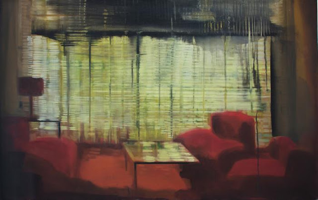
After Goya's often gravity-defying witches comes post-war aerialist, Peter Lanyon, an artist who meant nothing to me until Dr James Fox explained how his paintings worked. Lanyon seems something of a surprise choice for the Courtauld, but an inspired one, following Towner's William Gear show at a time when post-war British abstraction is not getting much attention.

Not that Lanyon was an abstract artist in the way that Ben Nicholson was in the 1930s, when it was strictly circles and squares only. Lanyon worked that rich margin between the abstract and the real, which in his case meant the landscape, coast and sky of Cornwall; his gliding paintings evoke (I imagine, having never done it) the strange experience of flying alone and unpowered, like a bird with prosthetic wings. For a more in-depth analysis, have a look at Laura Cummings' review.

David Jones, Capel-y-Ffin, 1927, Nat Museum Wales (copyright artist's estate)
Another artist who portrayed the invisible air as a palpable thing, albeit from the ground, was David Jones, the Anglo-Welsh artist whose work is fiercely championed by fans but not easily appreciated by people who haven't put a certain amount of time into the task. Actually this isn't quite true. For a few years in the 1920s David Jones was a bright star, a watercolourist who pleasantly combined sundry influences (Cezanne, Japanese prints, Celtic design) to create beautifully designed, distinctive paintings of places he loved, from Brockley to Capel-y-Ffin.

He was one of an exciting group of painters in a medium undergoing an unlikely 20th century renaissance, and something of a leader. Ravilious and Bawden admired his dry brush technique, and it was Jones who, as Secretary, invited the latter to show with the Seven and Five in 1932.

David Jones, The Terrace, 1929, Tate (copyright artist's estate)
But Jones was not content with his pleasing landscapes. Never a believer in traditional perspective or classical values, he moved further and further from simple representation. In the early 1930s, having written his extraordinary Great War poem 'In Parenthesis', he suffered a severe nervous breakdown, and it is tempting to see the increasing strangeness of his paintings at this time as a symptom of mental disturbance. One could say as easily that Van Gogh's greatest paintings were the product of madness, and I disagree profoundly with this view for reasons I imagine are fairly obvious.

David Jones didn't paint his extraordinary, melting, multi-layered paintings because he was going mad but because he was trying to push himself ever further towards a particular kind of vision. In a way he achieved this layering of realities, from everyday life as he saw it to Arthurian myth, most effectively in his poetry, yet the paintings give a great deal to the patient viewer. You can't simply look at a Jones watercolour and move on. You have to explore it. There are whole worlds contained in his more experimental paintings and sometimes it takes a while just to identify different objects, structures, layers. Everything is transparent.

David Jones, Flora in Calix-Light, 1950, Kettle's Yard (copyright artist's estate)
That this was a deliberate approach is clear when you look at his copper engravings from the 1920s, which show a similarly multi-layered approach. What is so remarkable about his work in watercolour (to which he added smudged graphite for its silvery quality and white body paint for substance) is his ability to dissolve boundaries, abandon traditional ideas of space and yet retain a kind of sense. There's a suggestion of medieval manuscript illumination in the pictures, but mixed in with the flat world of signs and symbols - chalices, thorns, unicorns - is a real, three-dimensional world in which land and sea dissolve into air which is translucent yet solid.

I think David Jones was a remarkable artist, far more adventurous than his mentor Eric Gill. Simon Martin and the Pallant House Gallery succeeded in persuading people that Edward Burra was a great artist despite choosing watercolour rather than oil paint as his medium (current auction estimates for his work are fairly shocking). Jones is harder to get into, but worth the effort.

'Soaring Flight: Peter Lanyon's Gliding Paintings' is at the Courtauld Gallery.
'David Jones: Vision and Memory' is at Pallant House Gallery, Chichester. The accompanying book, by Ariane Banks and Paul Hills, covers engravings and inscriptions as well as watercolour, and is thoroughly recommended.


Hammer Time: Modern British Art at Auction

$
0
0
Augustus John, Self-portrait, 1901, at Bonhams
For London's auctioneers, Modern British art is a booming business. Prices keep rising as interest in the period grows, and there's no shortage of work being put up for auction by the descendants of collectors active in the 1950s and 1960s. For those of us not in the market for a Lowry or even an Auerbach sketch, there's an opportunity to go and have a look at the work, marvel at the estimates and enjoy the whole showbiz art world thing.

The newspapers like auction season for its Antiques-Road-Show-moments, as when this Ravilious watercolour went under the hammer in Banbury last year. That story made the Daily Mail, and of course it was the high price fetched by the painting that attracted the paper's attention. If this had the effect of spreading the artist's name, which I'm sure it did, the downside is that a Ravilious watercolour is now unlikely to be bought by a public institution.

Eric Ravilious, 'Belle Tout Lighthouse', 1939, at Christies
Which is a pity, as there are two Ravilious watercolours in this month's auctions, an early painting called 'Drought' at Sotheby's (est. £40k-60k) and at Christie's a 1939 piece which was included in the exhibition at Dulwich, and which is being sold as 'Beachy Head Lighthouse (Belle Tout)' (est. £80k-120k). I wrote a note for the catalogue, which you can read here if you're interested. I hope whoever buys this lovely watercolour continues to lend it for exhibition as its current owner has done on several occasions.
LS Lowry, Tuesday Morning, Pendlebury, 1947, at Christies
Otherwise, this season brings Lowry, Lowry and more Lowry. Award for highest estimate goes to Sotheby's, with the frankly terrifying 'Father and Two Sons' priced around the £2 million mark, but Bonhams and Christie's both have a number of studies and drawings with some estimates lower than ten thousand. Henry Moore is also heavily represented, while Christie's has some unusual sculpture by Barbara Hepworth.

Barbara Hepworth, Hand Sculpture, 1953, at Christies
There are quite a few paintings by well-known artists in their signature styles, but also some more unusual work. Here are a few of my favourites, in no particular order. The sizes are dictated by the copy-able pictures available on the auction websites. My top pick I think has to be the John self-portrait at the top of the page - no wonder everyone thought he was a genius as a young man.

Edward Burra, Still Life with Teeth, 1946, at Sotheby's

Ceri Richards, Tinplate Workers, 1942, at Christies

John Craxton, Spring Leaves, 1943, at Bonhams

Henry Moore, Two Women Bathing a Child, 1946, at Christies

Augustus John, Ida, c1905, at Christies

Paul Nash, Objects in a Field, 1936, at Christies

Richard Nevinson, Road Through a Forest, c1920s, at Bonhams

Keith Vaughan, Landscape with Figures, 1944, at Bonhams

 Happy bidding!


Viewing all 249 articles
Browse latest View live